Accessibility Website Design for Small Business Owners: Finding Your Phoenix Coaching
The Client
Finding Your Phoenix Coaching is a mental health coaching practice founded by Ashley Townsend in Denver, Colorado.
Ashley is blind and when she came to The Design Wonder Studio, she wasn’t just looking of a designer. She was looking for someone she could trust completely. Someone willing to collaborate closely, communicate openly, and take accessibility seriously from day one.
She had spoken with designers before. What she encountered were people who weren’t interested in adapting their process or ensuring her brand and website would truly work for someone who is visually impaired. Bev at The Design Wonder Studio jumped at the opportunity to collaborate with Ashley.
The Brand & Website Process
With Ashley being visually impaired, every design decision became a deeper conversation. Colors were described not just by name but by feeling and intention. Mood and tone became the language of the whole process.
In addition, we tested the site using Ashley’s screen reader before launch, working through the navigation, the button labels, the image descriptions, and the flow of each page as it was read aloud. Accessibility was built into the foundation of every decision.
Ashley now has a brand and website she can feel confident in, not because she had to trust me, but because we built it together.
Creative Direction
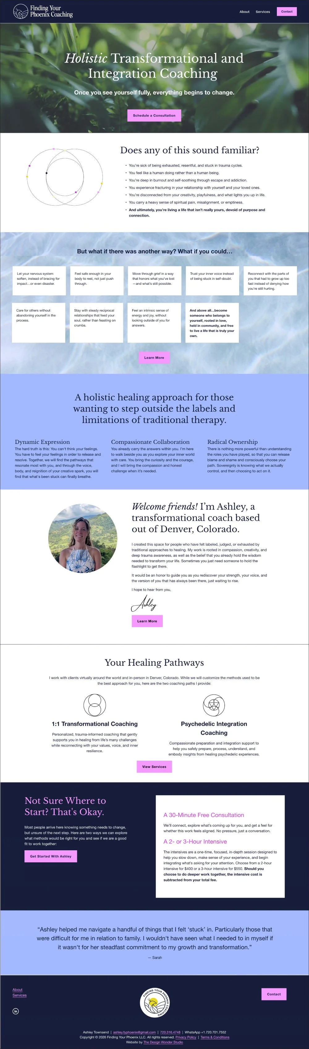
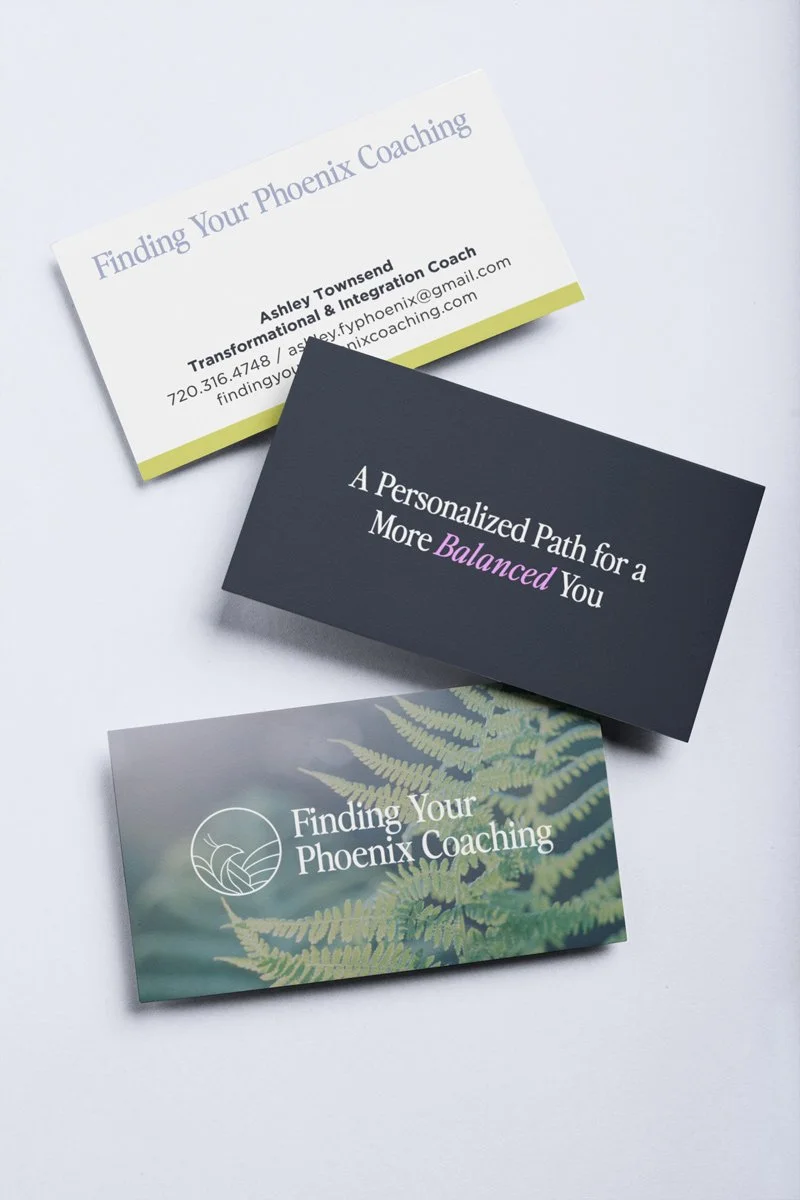
The visual direction draws from nature, human depth, and re-centering. The kind of imagery that slows you down and makes you feel held. Deep, dark tones form the foundation of the palette, anchored by bright, unexpected pops of color that bring energy and aliveness without disrupting the calm. The overall feel sits somewhere between modern and organic: a little psychedelic, deeply natural, and unmistakably warm.

Grounding and Expansive
Growth, Renewal, and Human Connection

Open Minded and Supportive
Logo Design
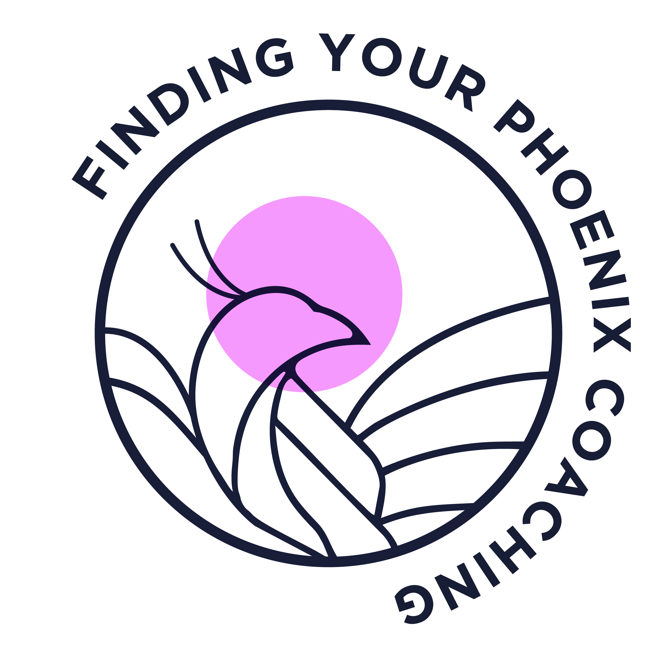
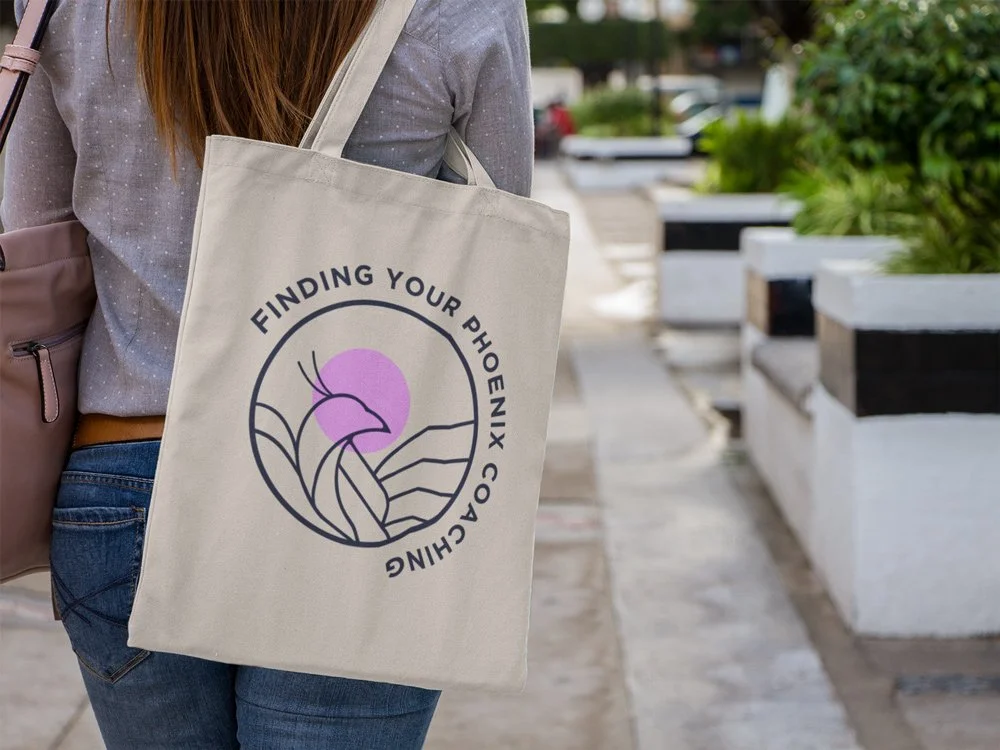
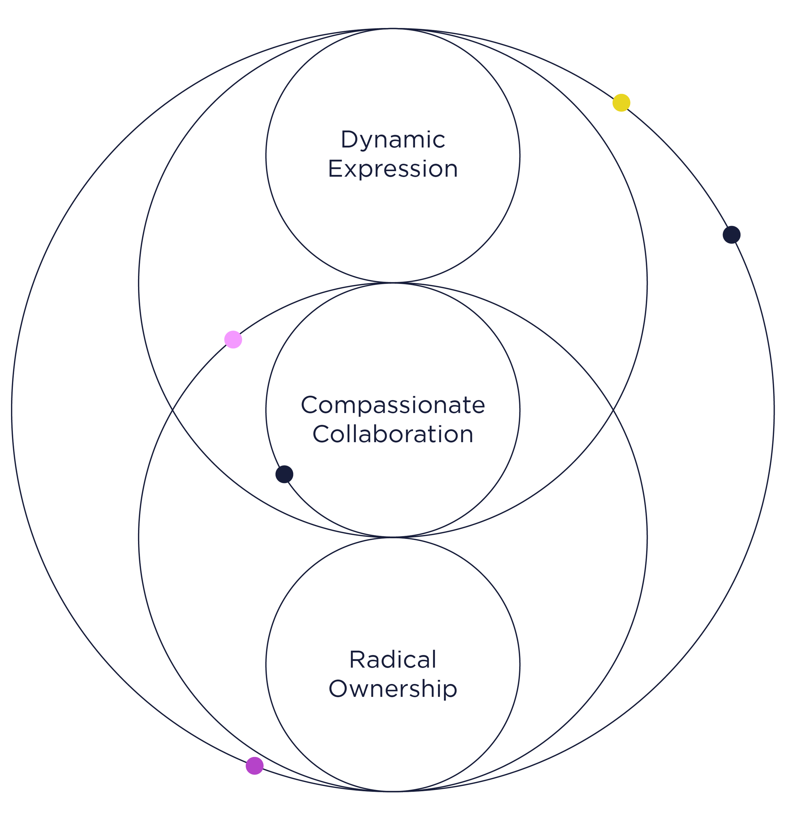
Her original logo of a phoenix was recreated to feel more unique, softer, and paired with the name of her business. The theme of the circle around the phoenix is also repeated throughout the website visuals, and represents that each persons journey is different, being created by different pieces of a puzzle.

Original Logo


Website Strategy and Design
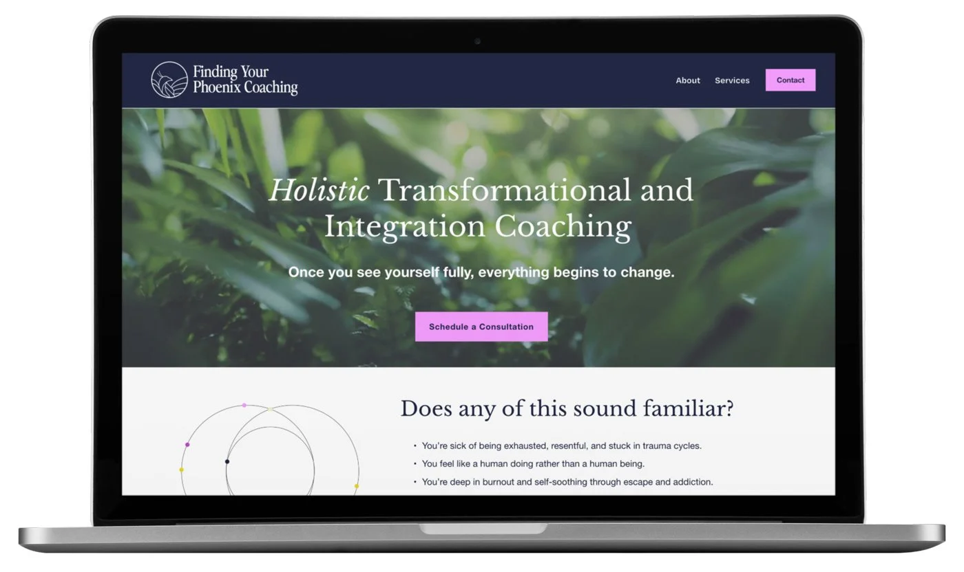
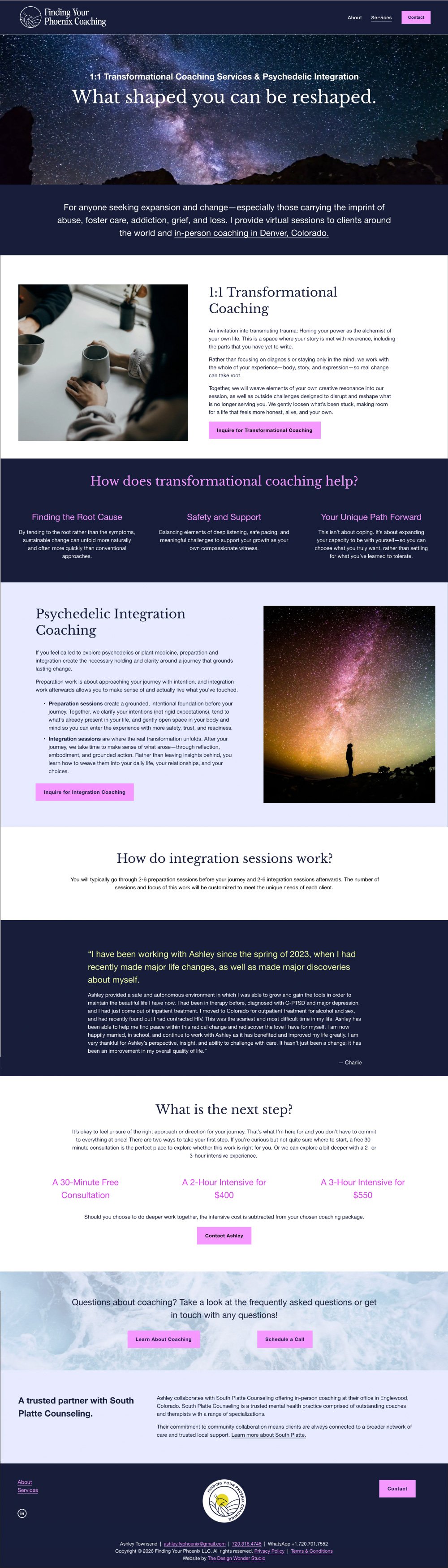
We carefully crafted the copy to give visitors a genuine understanding of both transformational coaching and psychedelic integration: what each involves, who it’s for, and what to expect from the process. Ashley is positioned as someone with real clinical grounding who chose freedom, which is exactly the story her ideal client needs to hear.
Accessibility wasn’t a checklist we worked through at the end. It was a lens applied to every decision from the start.
The color contrast was checked to ensure the palette meets accessibility standards. Button labels were written to be clear and engaging. Image alt text was written with intention, describing not just what is in each photo but what it communicates about the brand. Heading structure follows a logical hierarchy so the page reads cleanly from top to bottom whether you’re scanning visually or navigating by screen reader.
Ashley and I tested the site together using her screen reader. That session caught things a visual review never could, and is a really important part of the process for website design. The result is a site that works for every visitor and one that truly reflects the person who built the business it represents.